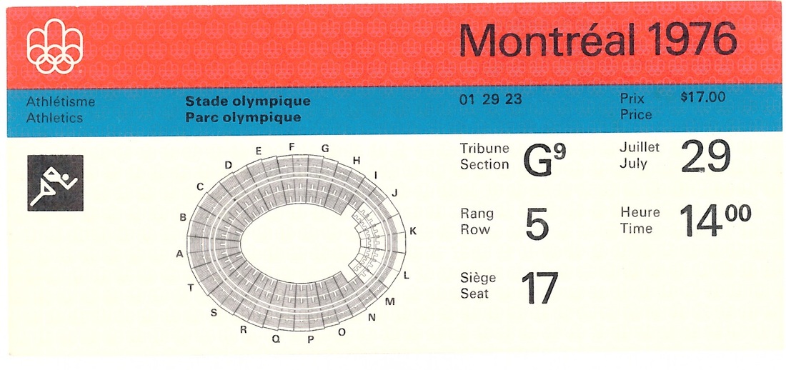
The Olympic Report comments upon the ticket design thusly:
"The prestige attached to the Olympics contributed much to the design of the tickets used for the Montréal Games. Everything seemed to point to the grandeur of the event: the way the design was executed, the shape (14.5 x 6 cm), the colors, and the graphics in general. They were obviously meant to be retained as souvenirs. But their prime purpose was to make for easier control at the wickets and, by the same token, to allow people to get to their seats quickly.
The front of each ticket was printed in three colors with a red stripe, above which was the official emblem of the Montréal Games; under this stripe the color varied according to the competition site whose numerical symbol was displayed. On the lower part, against a grey background, were the sport pictogram and a miniature plan of the competition site. The necessary alphanumerical symbols were printed in black.
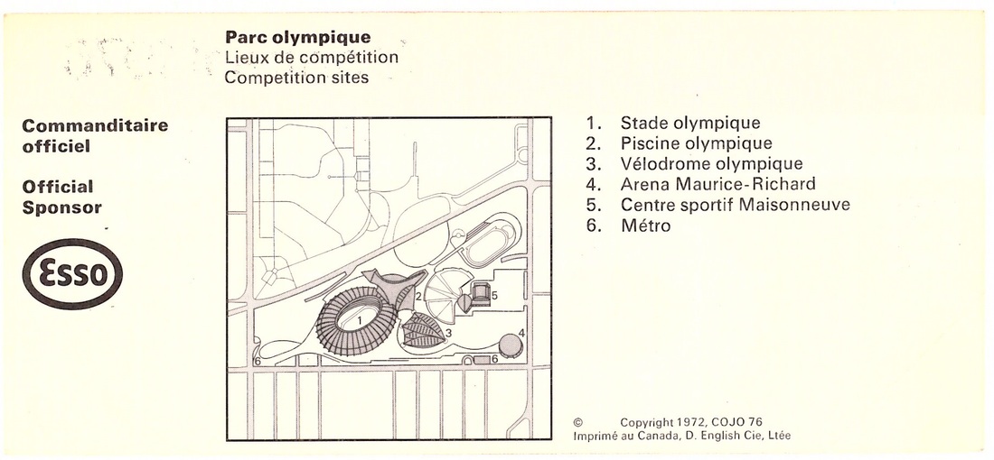
On the reverse side, there was a stylized plan of the region showing the general area of the competition site, with the remaining part of the ticket reserved for the commercial message of one of the official sponsors of the Games.
Several precautions were taken against counterfeiting, falsification, and theft. First of all, the tickets were printed on white water-marked paper specially made for COJO. The data on the ticket that remained unchanged was lithographed, while variable information was printed by letterpress. The final stage of production could thus be delayed as long as possible, and lastminute changes could be made, for example, where the number of available seats was in doubt at any one site. The issue of tickets could, therefore, be programmed to tie in with scheduled distribution.
The upper left-hand corner was perforated diagonally so that it could be detached upon admission, and this feature was particularly suited for those sites equipped with turnstiles. Any ticket so mutilated could not be used again."